Development Challenge: Building a Collapsible AppBar in Flutter Part 2
Improving on the collapsible app bar with animated leading and trailing icons.
Last week, I outlined a solution I came up with in building a collapsible app bar that has a background image with a blurring effect when the app bar is fully collapsed.
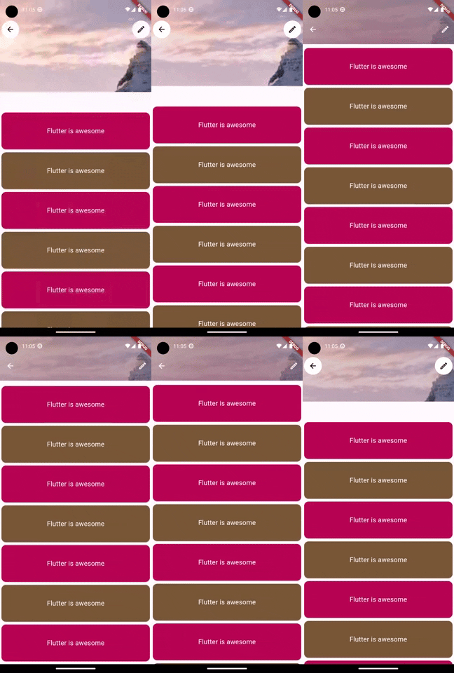
To further improve on, we will now add two actions buttons on this collapsible app bar, the first on the left will be a back button (using an arrow back icon) while the other will be an edit button (using the edit icon). The fun part is that we will animate these icons/buttons to change their behaviour based on the scrolling progress. When the flexible app bar is fully expended, with the background pictures "ublurred", it is useful to have a white border around the icons (to give them a contrast with the background and an elevated feel). However, when the app bar is fully collapsed and with a fully blurred background image, it is we can remove these white burders and use just the icons in the app bar. A sneak peak of the desired behaviour is shown below:

The main idea to implement this is to first add an AppBar widget on top of the other widgets in the Stack widget that we have before in the Part 1 of this post. This AppBar widget will contain the leading and trailing buttons. To make the buttons change behaviour, we will choose a point between 0 and 1 (0.5 for example), which indicates the point during the scrolling progress at which the icons will change. In the code below, we update the Stack to contain the AppBar widget with both trailing and leading buttons with white borders. We all create and set the animationThreshold variable to 0.5.
MyPersistentSliverAppBar({
    required this.collapsedHeight,
    required this.expandedHeight,
  });

  @override
  Widget build(
      BuildContext context, double shrinkOffset, bool overlapsContent) {
    final progress = shrinkOffset / maxExtent;
    const Duration appBarAnimationDuration = Duration(milliseconds: 150);
    const double animationThreshold = 0.5;
    return Stack(
      clipBehavior: Clip.none,
      fit: StackFit.expand,
      children: [
        Container(
          height: maxExtent,
          clipBehavior:
              Clip.hardEdge, //prevent blurr from affecting whole screen
          decoration: const BoxDecoration(
            image: DecorationImage(
              image: NetworkImage('https://picsum.photos/seed/picsum/200/300'),
              fit: BoxFit.cover,
            ),
          ),
          child: BackdropFilter(
            filter: ImageFilter.blur(
              sigmaX: 90,
              sigmaY: 90,
            ),
            child: Container(
              color: Colors.black.withOpacity(0.3),
            ),
          ),
        ),
        AnimatedOpacity(
          duration: appBarAnimationDuration,
          opacity: 1 - progress,
          child: Image.network(
            'https://picsum.photos/seed/picsum/200/300',
            width: MediaQuery.of(context).size.width,
            fit: BoxFit.cover,
          ),
        ),
        // add an AppBar on top of the Stack
        AppBar(
          backgroundColor: Colors.transparent,
          leading: Container(
            decoration: const BoxDecoration(
              color: Colors.white, // Background color
              shape: BoxShape.circle,
            ),
            margin: const EdgeInsets.all(4), // Adjust the margin as needed
            child: IconButton(
              icon: const Icon(Icons.arrow_back, color: Colors.black),
              onPressed: () {
                Navigator.of(context).pop();
              },
            ),
          ),
          actions: [
            Container(
              decoration: const BoxDecoration(
                color: Colors.white, // Background color
                shape: BoxShape.circle,
              ),
              margin: const EdgeInsets.all(4), // Adjust the margin as needed
              child: IconButton(
                icon: const Icon(Icons.edit_outlined, color: Colors.black),
                onPressed: () {
                  Navigator.of(context).pop();
                },
              ),
            ),
          ],
          elevation: 0,
        ),
      ],
    );
  }
  @override
  double get maxExtent => expandedHeight;
  @override
  double get minExtent => collapsedHeight;
  @override
  bool shouldRebuild(SliverPersistentHeaderDelegate oldDelegate) => false;
}
Now we just have to make the leading and trailing icons change based on the whether the scrolling progress is more than 0.5 or not. The full updated class is shown below:
class MyPersistentSliverAppBar extends SliverPersistentHeaderDelegate {
  final double expandedHeight;
  final double collapsedHeight;

  MyPersistentSliverAppBar({
    required this.collapsedHeight,
    required this.expandedHeight,
  });

  // final String _actionIconType = "elevated";

  @override
  Widget build(
      BuildContext context, double shrinkOffset, bool overlapsContent) {
    final progress = shrinkOffset / maxExtent;
    const Duration appBarAnimationDuration = Duration(milliseconds: 150);
    const double animationThreshold = 0.5;
    return Stack(
      clipBehavior: Clip.none,
      fit: StackFit.expand,
      children: [
        Container(
          height: maxExtent,
          clipBehavior:
              Clip.hardEdge, //prevent blurr from affecting whole screen
          decoration: const BoxDecoration(
            image: DecorationImage(
              image: NetworkImage('https://picsum.photos/seed/picsum/200/300'),
              fit: BoxFit.cover,
            ),
          ),
          child: BackdropFilter(
            filter: ImageFilter.blur(
              sigmaX: 90,
              sigmaY: 90,
            ),
            child: Container(
              color: Colors.black.withOpacity(0.3),
            ),
          ),
        ),
        AnimatedOpacity(
          duration: appBarAnimationDuration,
          opacity: 1 - progress,
          child: Image.network(
            'https://picsum.photos/seed/picsum/200/300',
            width: MediaQuery.of(context).size.width,
            fit: BoxFit.cover,
          ),
        ),
        AppBar(
          backgroundColor: Colors.transparent,
         // change button based on scroll progress
          leading: (1 - progress) <= animationThreshold
              ? IconButton(
                  icon: const Icon(Icons.arrow_back),
                  onPressed: () {
                    Navigator.of(context).pop();
                  },
                  color: Colors.white,
                )
              : Container(
                  decoration: const BoxDecoration(
                    color: Colors.white, // Background color
                    shape: BoxShape.circle,
                  ),
                  margin: const EdgeInsets.all(4), // Adjust the margin as needed
                  child: IconButton(
                    icon: const Icon(Icons.arrow_back, color: Colors.black),
                    onPressed: () {
                      Navigator.of(context).pop();
                    },
                  ),
                ),
          actions: [
            // change button based on scroll progress
            (1 - progress) <= animationThreshold
                ? IconButton(
                    icon: const Icon(Icons.edit_outlined),
                    onPressed: () {
                      Navigator.of(context).pop();
                    },
                    color: Colors.white,
                  )
                : Container(
                    decoration: const BoxDecoration(
                      color: Colors.white,
                      shape: BoxShape.circle,
                    ),
                    margin: const EdgeInsets.all(4),
                    child: IconButton(
                      icon: const Icon(Icons.edit_outlined, color: Colors.black),
                      onPressed: () {
                        Navigator.of(context).pop();
                      },
                    ),
                  ),
          ],
          elevation: 0,
        ),
      ],
    );
  }

  @override
  double get maxExtent => expandedHeight;

  @override
  double get minExtent => collapsedHeight;

  @override
  bool shouldRebuild(SliverPersistentHeaderDelegate oldDelegate) => false;
}
With this update, the leading and trailing button now changes based on the scrolling progress. What do you think this little hack?
