Development Challenge: Building a Collapsible AppBar in Flutter
How I built a collapsible app bar with a blurred background effect on scrolling while designing the user profile page of Waki
As we kickstarted the UI development of Waki in late January, Anderson and I decided to split the development work, with Anderson working on the home of the app while I work on the user profile and account settings of the app.
So I naturally had to come up with a design and implementation of the user profile page in Flutter. The idea is to create a collapsible app bar header with a background picture (configurable by the user) that would be blurred when it is collapsed and not blurred when completely expanded (on scrolling). After a bit of research, I came up with the solution that I summarise below.
My solution is to use a NestedScrollView() widget. This widget has a headerSliverBuilder parameter that accepts a List<Widget>. To achieve the app bar with a background picture, I passed a list containing a SliverPersistentHeader class to the headerSliverBuilder parameter of the of the NestedScrollView(). The SliverPersistentHeader class then returns a Stack widget, first containing the blurred background image, and then the background image (without the blurred effect). To make the "unblurred" background image disappear when the page is scrolled up and the app bar is fully collapsed, I wrapped it in an AnimatedOpacity widget which makes the background image gradually disappear as the user scrolls up to reveal the blurred background image below it in the Stack widget.
I provide a concrete example below. First we create the boilerplate code for an app page and put some stuff in the body.
import 'dart:ui';
import 'package:flutter/material.dart';

void main() {
  runApp(const MyAppBarApp());
}

class MyAppBarApp extends StatelessWidget {
  const MyAppBarApp({super.key});
  // This widget is the root of the application.
  @override
  Widget build(BuildContext context) {
    return const MaterialApp(
      home: SliverHeaderExample(),
    );
  }
}

class SliverHeaderExample extends StatelessWidget {
  const SliverHeaderExample({super.key});

  @override
  Widget build(BuildContext context) {
    return Scaffold(
      body: NestedScrollView(
        physics: const BouncingScrollPhysics(),
        headerSliverBuilder: (context, innerBoxIsScrolled) {
          return [
            // will build Sliver header here
          ];
        },
        // put some stuff in the body section of NestedScrollView()
        body: ListView.builder(
          itemCount: 100,
          itemBuilder: (BuildContext context, int index) {
            return Card(
              color: index % 2 == 0 ? const Color(0xFFBC004F) : const Color(0xFF75565B),
              child: Container(
                alignment: Alignment.center,
                width: double.infinity,
                height: 100.0,
                child: const Text(
                  'Flutter is awesome',
                  style: TextStyle(fontSize: 18.0),
                ),
              ),
            );
          },
        ),
      ),
    );
  }
}
The headerSliverBuilder argument of the NestedScrollView accepts a list of widgets, which typically contains an AppBar or TabBar. In our case we will return a SliverPersistentHeader with a delegate which inherits from SliverPersistentHeaderDelegate class, in the block below:
// fixed code above
      body: NestedScrollView(
        physics: const BouncingScrollPhysics(),
        headerSliverBuilder: (context, innerBoxIsScrolled) {
          return [
            // return SliverPersistentHeader
            SliverPersistentHeader(
              pinned: true,
              delegate: MyPersistentSliverAppBar(
                expandedHeight: 250,
                collapsedHeight: 120,
              ),
            ),
          ];
        },
//fixed code below
The MyPersistentSliverAppBar will extend the SliverPersistentHeaderDelegate class, whose build function gives us access to a shrinkOffset variable which tells us by how much the sliver has been shrunk. In addition, we can override the maxEntent and minExtent variables of the parent SliverPersistentHeaderDelegate class by using getter methods to return our own desired expandedHeight and collapsedHeight.
The implementation of MyPersistentSliverAppBar then returns a Stack Widget, containing first the blurred background image and then the original background image contained in an animated opacity as shown below:
class MyPersistentSliverAppBar extends SliverPersistentHeaderDelegate {
  final double expandedHeight;
  final double collapsedHeight;

  MyPersistentSliverAppBar({
    required this.collapsedHeight,
    required this.expandedHeight,
  });

  @override
  Widget build(BuildContext context, double shrinkOffset, bool overlapsContent) {
    // create variable to track scrolling progress
    final progress = shrinkOffset / maxExtent;
    const Duration appBarAnimationDuration = Duration(milliseconds: 150);

    return Stack(
      clipBehavior: Clip.none,
      fit: StackFit.expand,
      children: [

        // blurred background image
        Container(
          height: maxExtent,
          clipBehavior:
              Clip.hardEdge, //prevent blurr from affecting whole screen
          decoration: const BoxDecoration(
            image: DecorationImage(
              image: NetworkImage('https://picsum.photos/seed/picsum/200/300'),
              fit: BoxFit.cover,
            ),
          ),
          child: BackdropFilter(
            filter: ImageFilter.blur(
              sigmaX: 90,
              sigmaY: 90,
            ),
            child: Container(
              color: Colors.black.withOpacity(0.3),
            ),
          ),
        ),

        // background without blurr
        AnimatedOpacity(
          duration: appBarAnimationDuration,
          opacity: 1 - progress, // fully transparent on scrolling progress = 1
          child: Image.network(
            'https://picsum.photos/seed/picsum/200/300',
            width: MediaQuery.of(context).size.width,
            fit: BoxFit.cover,
          ),
        ),

      ],
    );
  }
  @override
  double get maxExtent => expandedHeight;
  @override
  double get minExtent => collapsedHeight;
  @override
  bool shouldRebuild(SliverPersistentHeaderDelegate oldDelegate) => false;
}
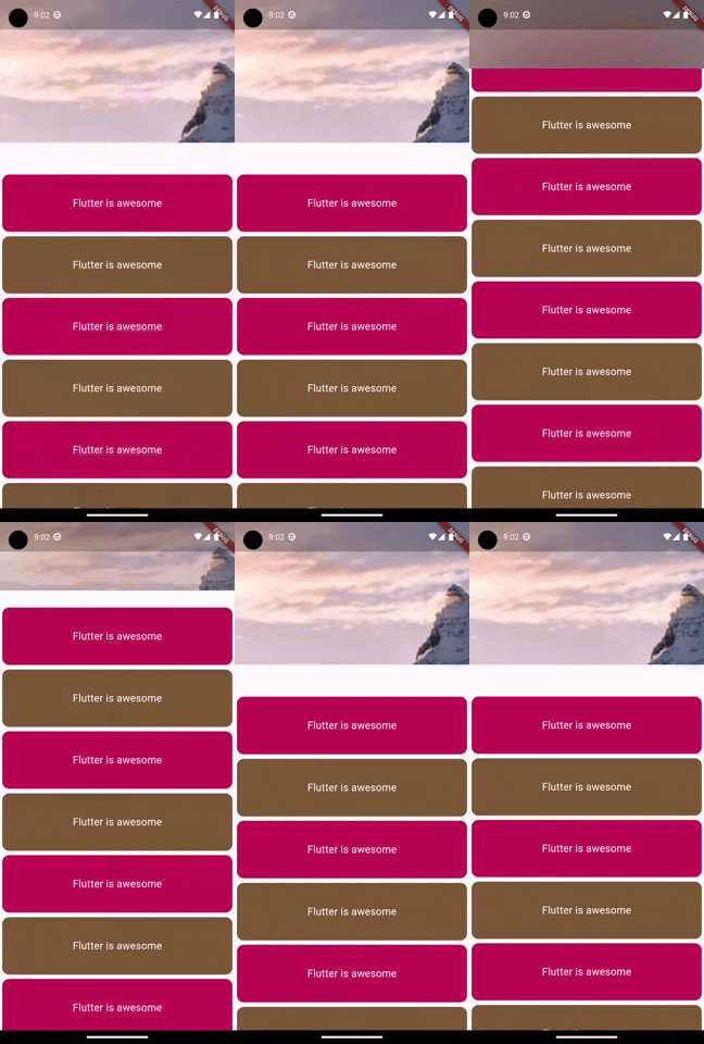
With the changes above, we can already test the collapsible app as show below

By adding more widgets to the Stack widget inside the MyPersistentSliverAppBar, we can further customize the app bar, e.g., by adding naviagation buttons etc. I will probably write another post along this line, looking into into how to further customize the app bar.
What do you think of the solution I came up with? Have an even better idea for implementating this? Why not comment below and let me know!
